Case study
Zeka: Reinventing education through simplicity

Introduction
I saw universities struggling as teachers, admins, and students stuck with messy data and complicated tools. It was a headache! So, I designed Zeka, a web-based app to make things easier. Unlike those confusing systems that slow everyone down, Zeka’s simple and quick to use. I wanted to help them focus on education, not paperwork. Couldn’t something better change how they work?
Outcome
This video I prototyped demonstrates how the product works.
User research and feedback had revealed flaws in existing tools, so I crafted this solution for professors and admins based on those findings.
Primary Research
To gain a raw
and unfiltered understanding of university challenges, I conducted in-person interviews at a
local university campus. I spoke with 12 stakeholders, including teachers, admins,
and students for 25 to 30 minutes each.
I explored their daily workflows, frustrations, and needs. The conversations were transcribed
and analyzed, leading to key insights (see Zeka Interview
Notes).
Here’s what they
shared:
*Teachers spend hours on attendance and grading, buried in paperwork and email clutter.
*Admins manually enter data with no history or organization, making their work slow and repetitive.
*Students struggle to find grades and updates quickly since everything is scattered and delayed.
*Everyone wants a single, simple system to streamline it all.
Secondary Research
To contextualize
my user findings, I explored the EdTech and SaaS landscape, drawing from industry reports,
competitor analyses, and usability studies as of May 11, 2022. This broadened my understanding
of market gaps and trends Zeka could leverage.
Here’s what I uncovered:
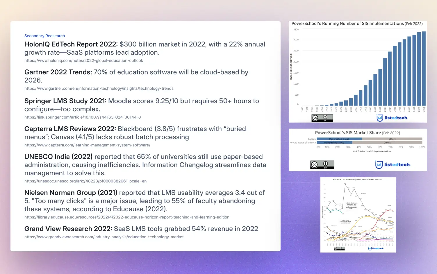
Research Findings
After interviewing university stakeholders and analyzing EdTech trends, I uncovered key insights driving Zeka’s design.

Crafting User Personas
My research uncovered key stakeholder challenges, further validated through 12 interviews. Using these insights, I developed three personas: Teacher, Admin, and Student to highlight inefficiencies and needs. These personas served as a foundation for designing Zeka with a focus on simplicity and clarity.
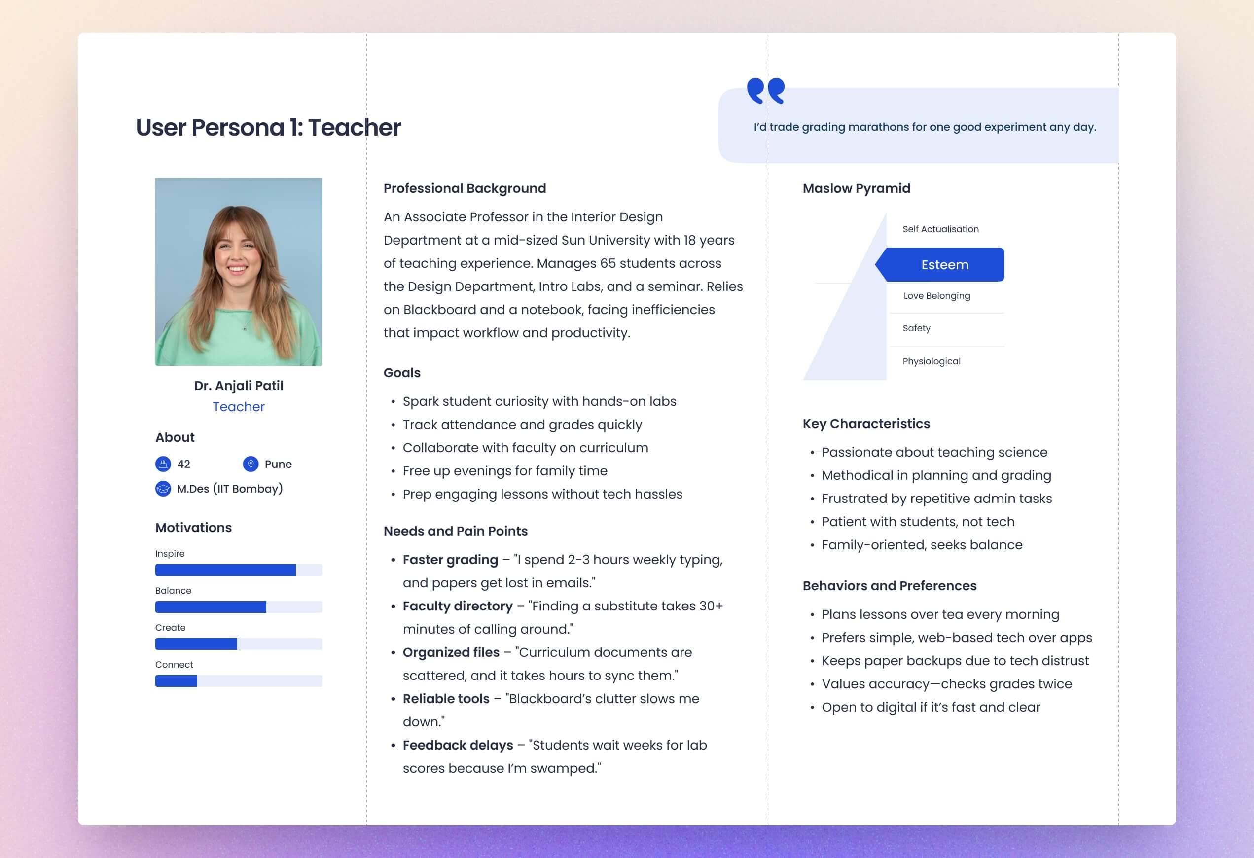

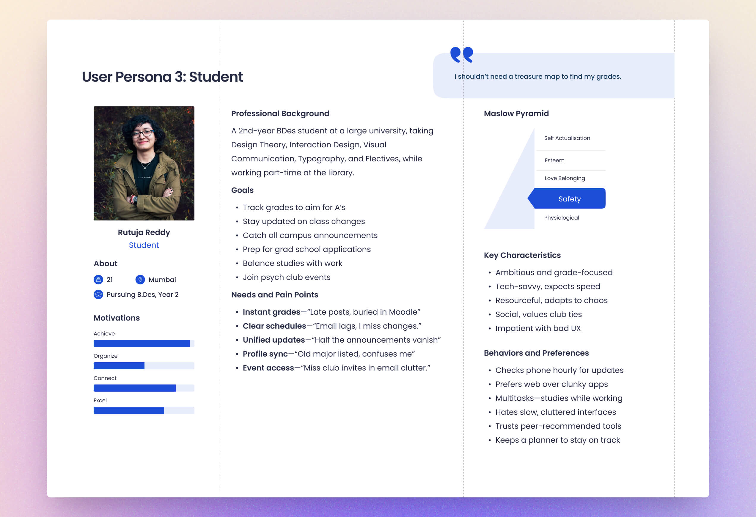
There was also a fluid aspect to this, where personas evolved as I uncovered new user needs, shaping Zeka’s features organically.
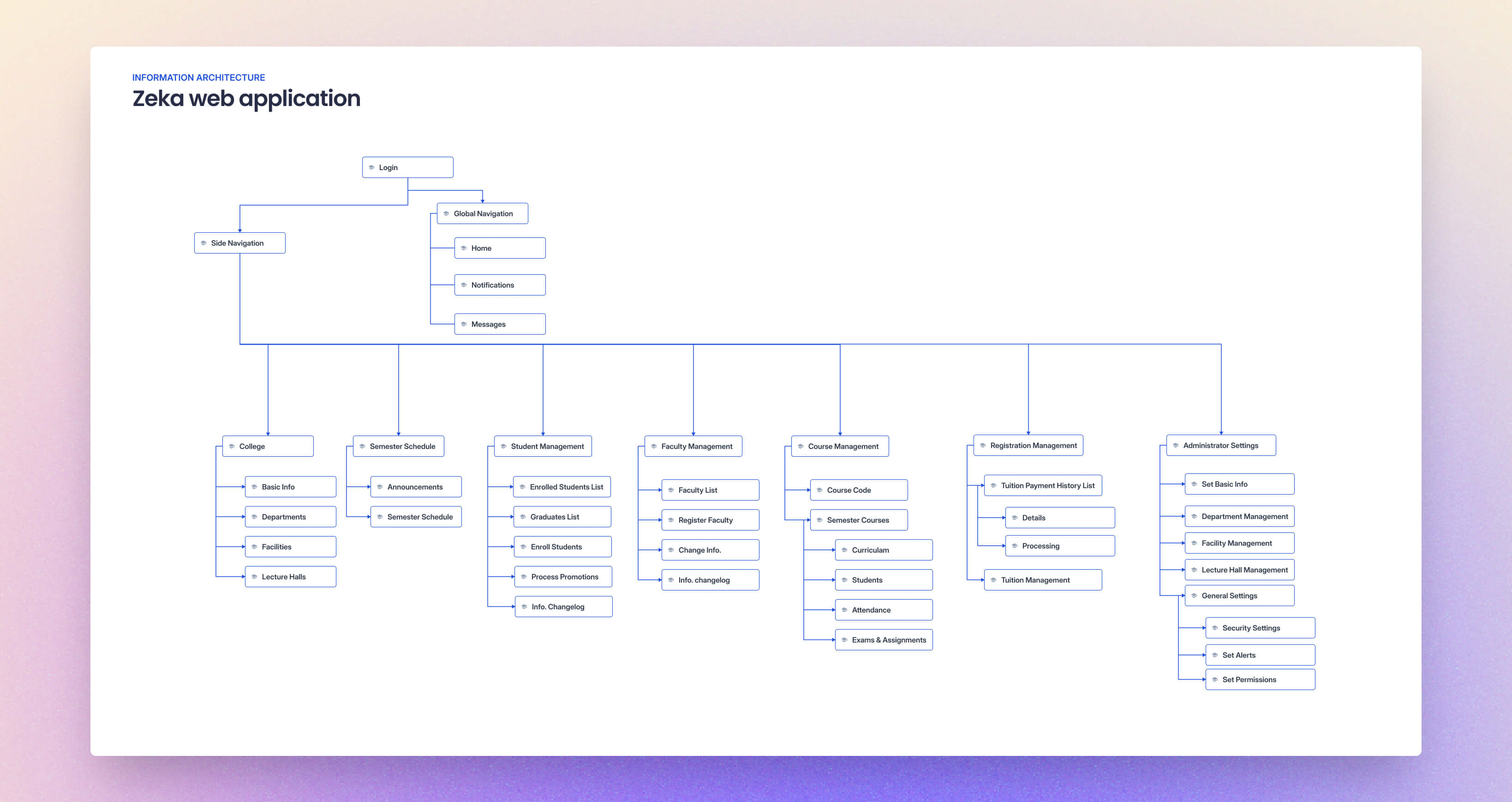
Sketching Simplicity: Early Zeka Flows
My personas gave me deep insights into user frustrations, such as Rutuja's scattered updates. To refine solutions for Zeka, I combined these insights with UX best practices.
I sketched streamlined grading flows for Anjali, automated enrollment tools for Raghav, and a unified info hub for Rutuja, allowing quick iterations while focusing on reducing complexity and improving efficiency.


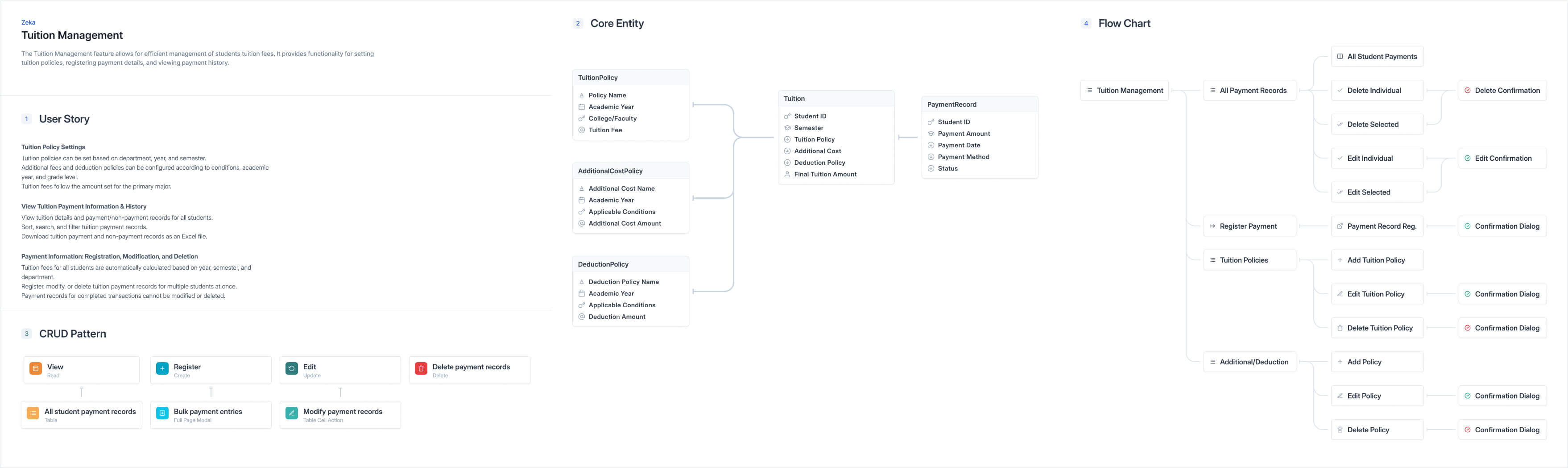
Zeka’s Design System
I created a design system to maintain consistency and clarity throughout Zeka. By defining colors, typography, and components, I built a reliable foundation that guided me through wireframes and beyond.
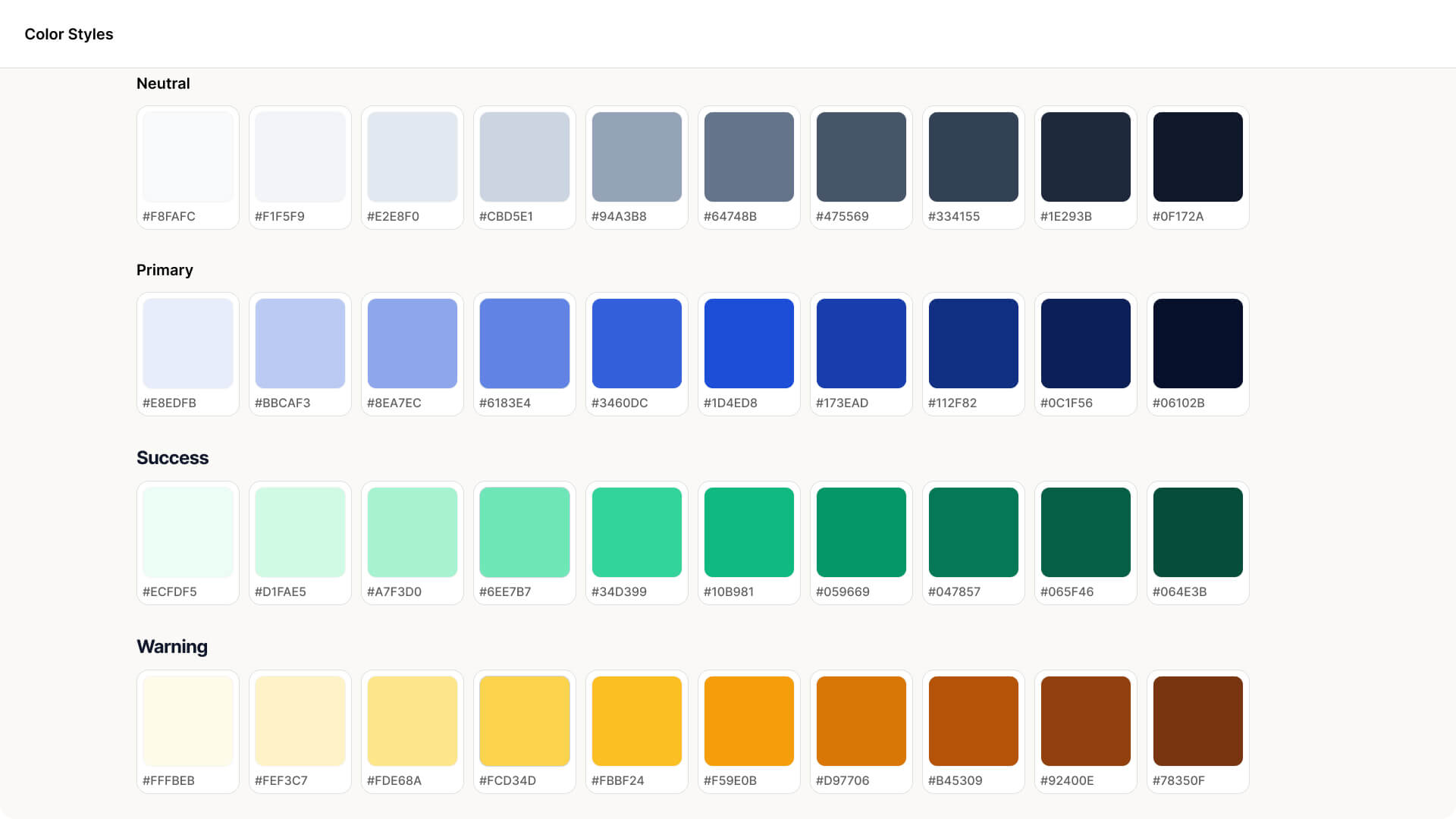
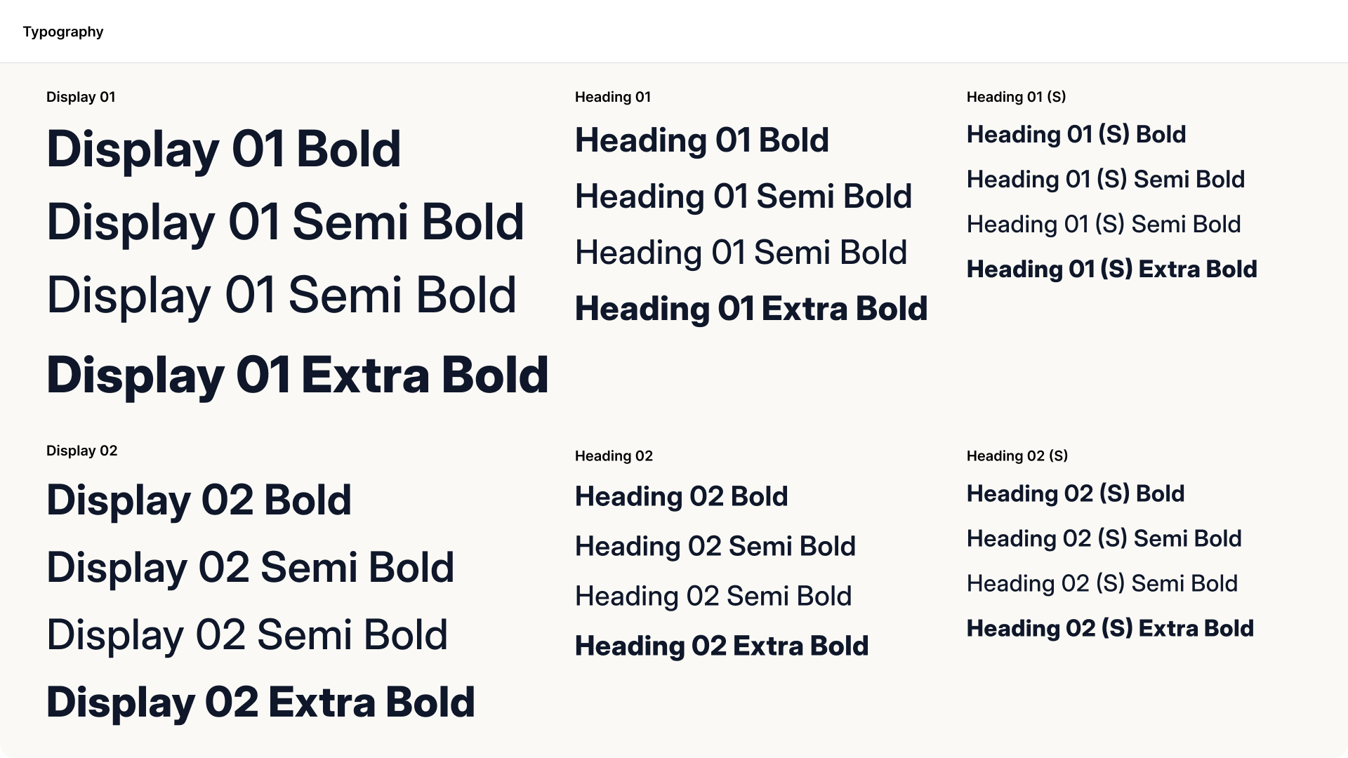
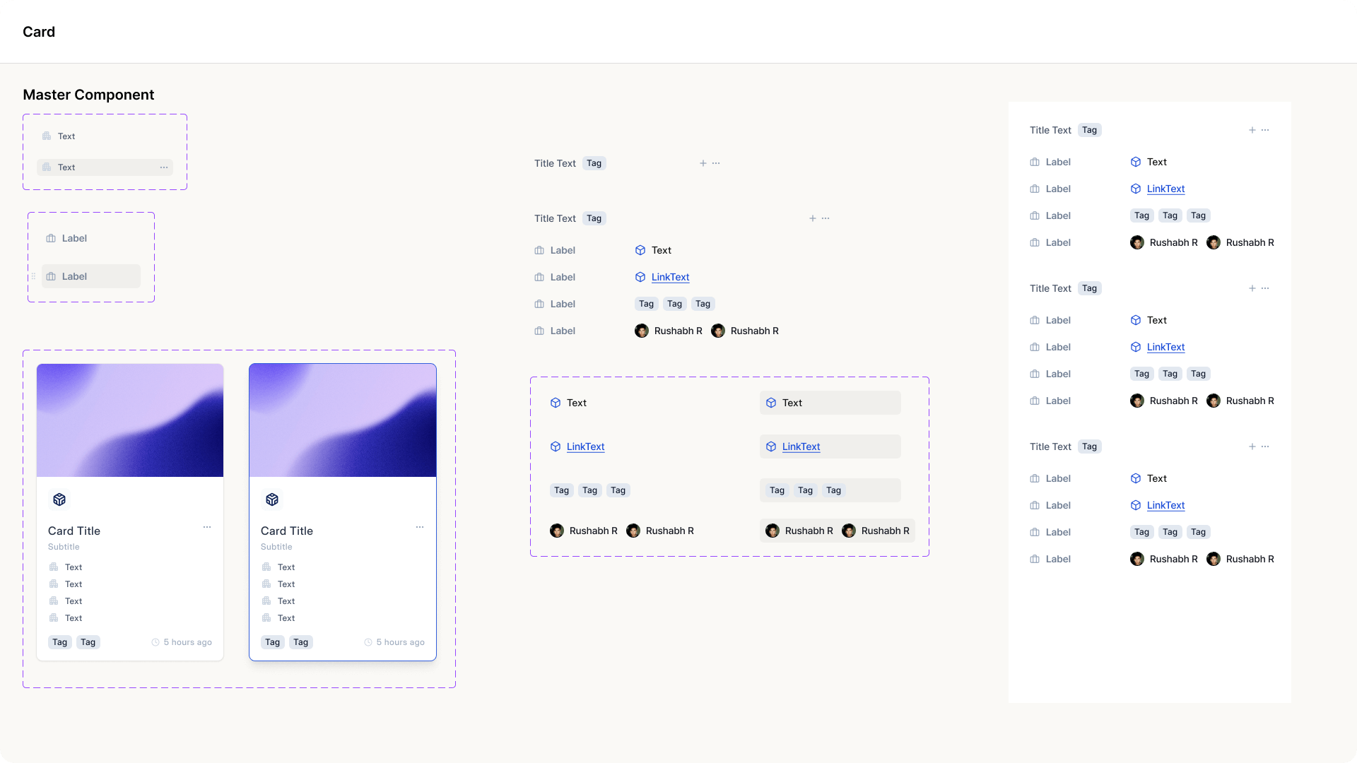
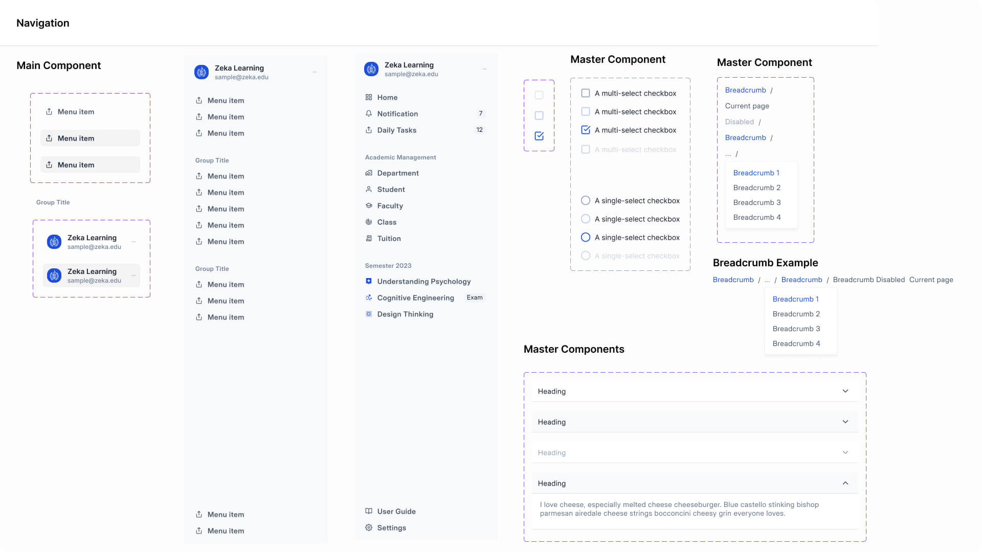
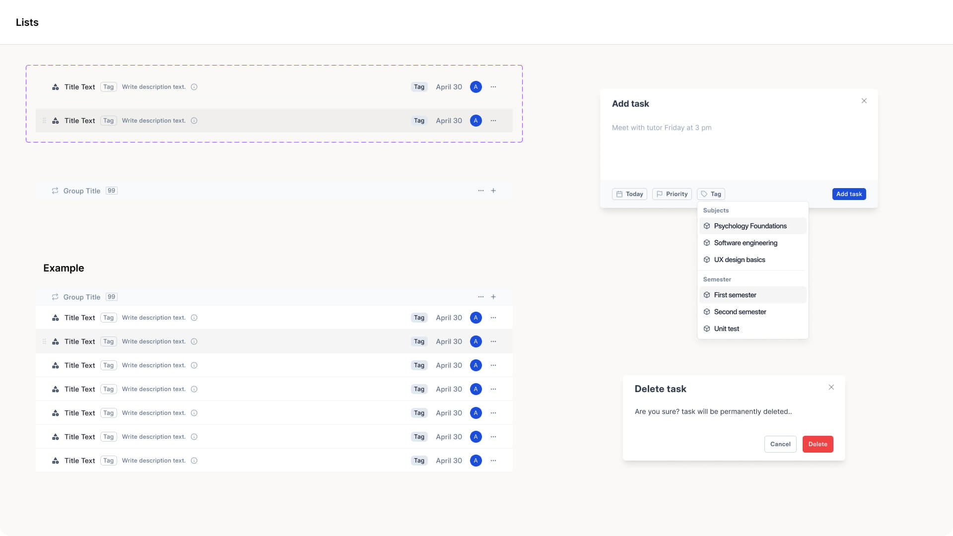
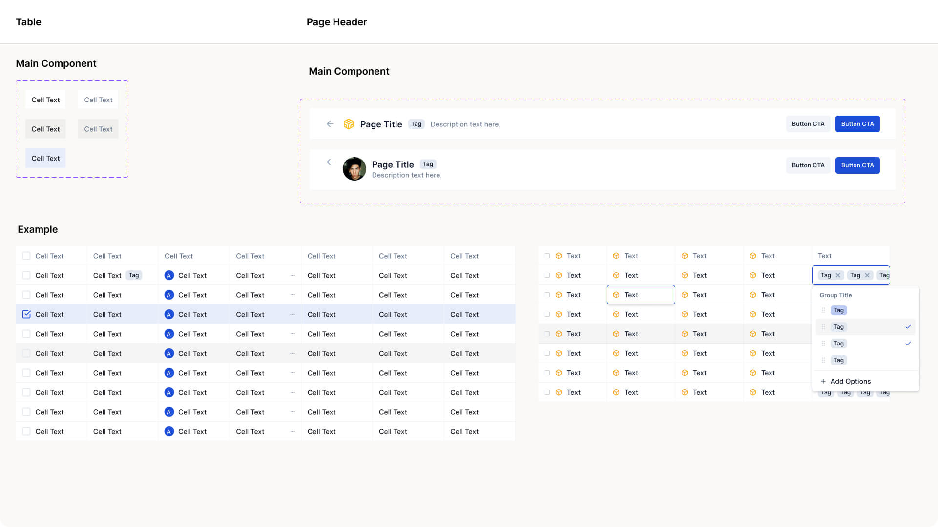
I added components as I went, keeping the design system practical and flexible.
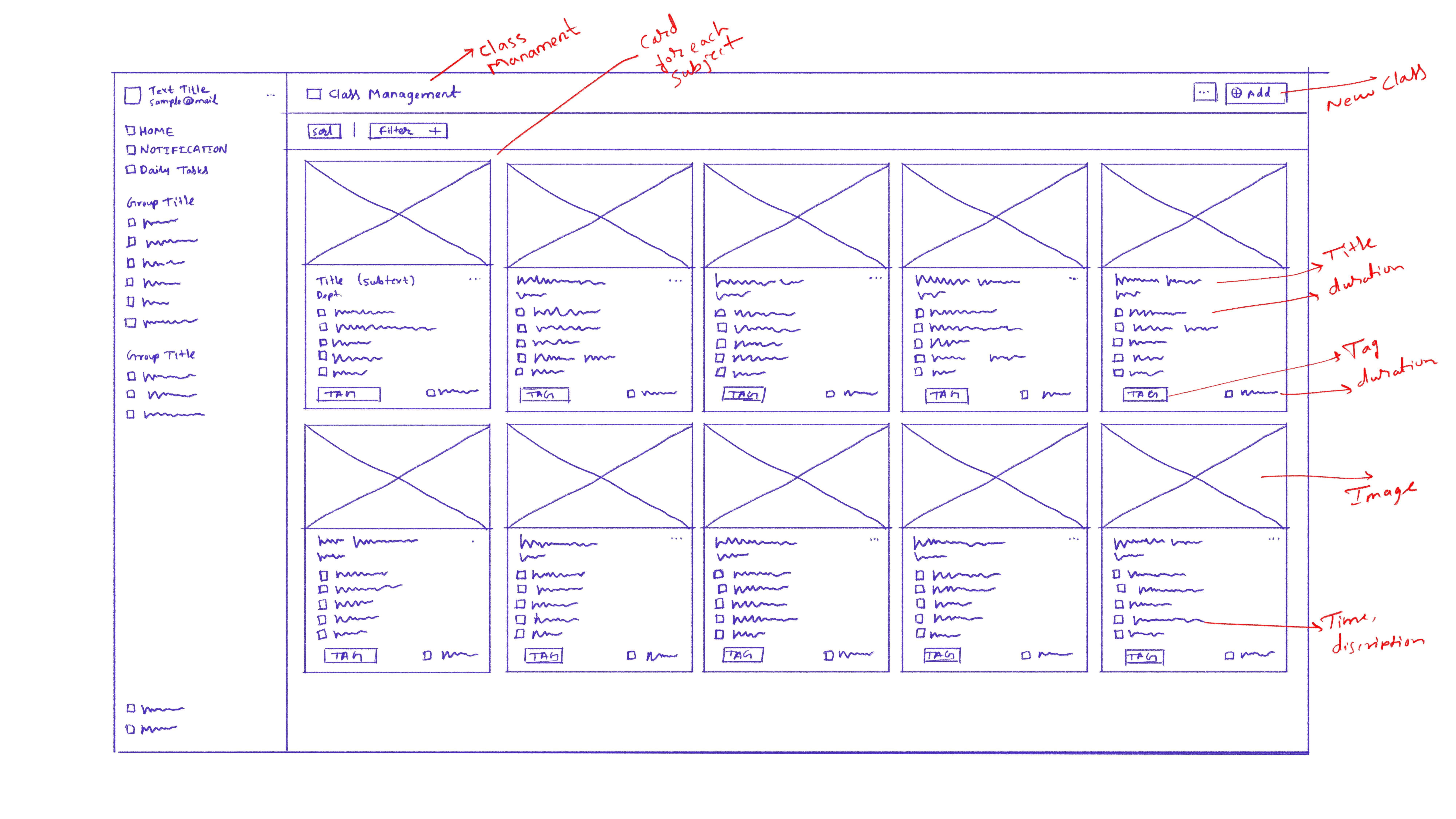
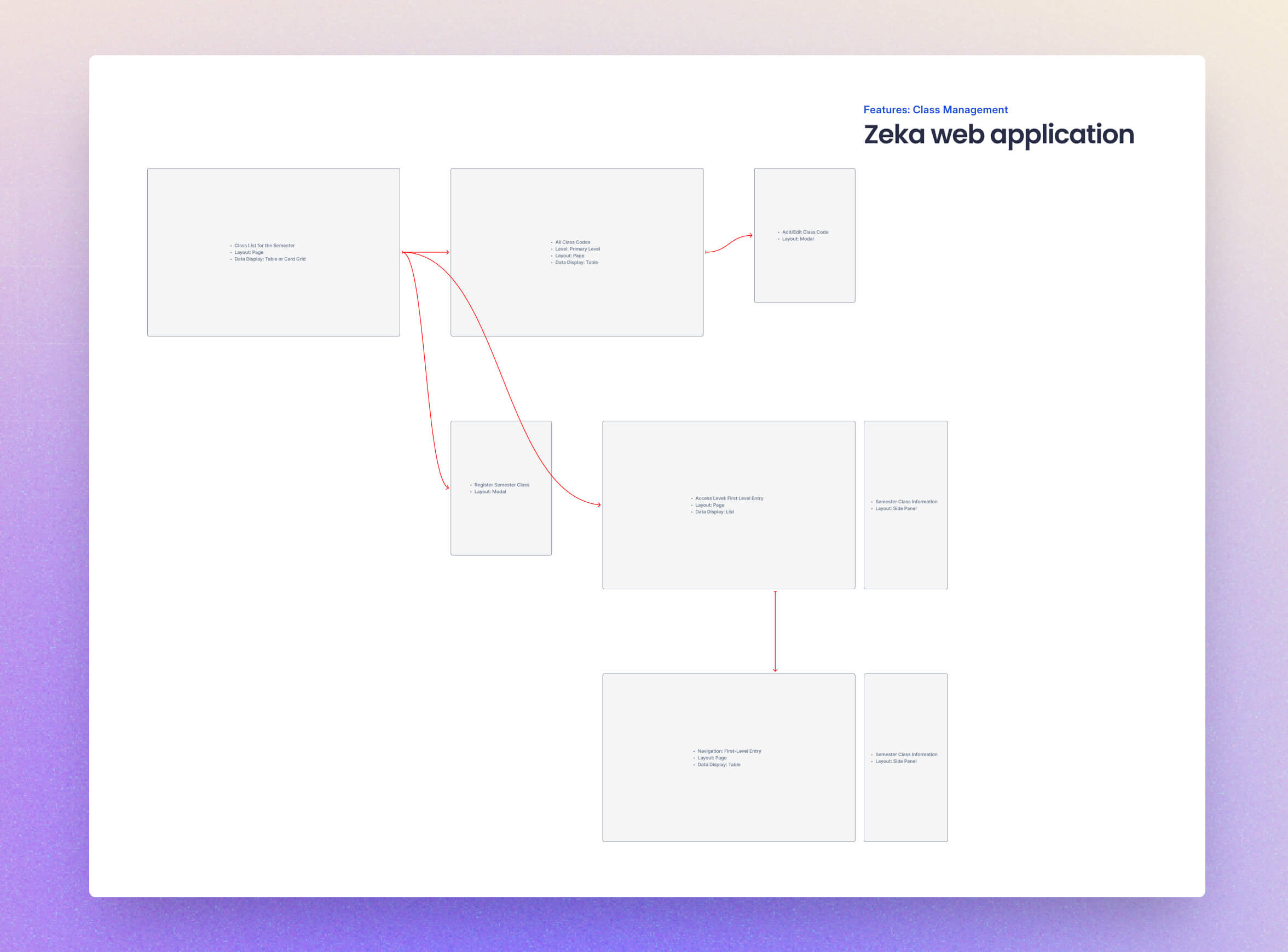
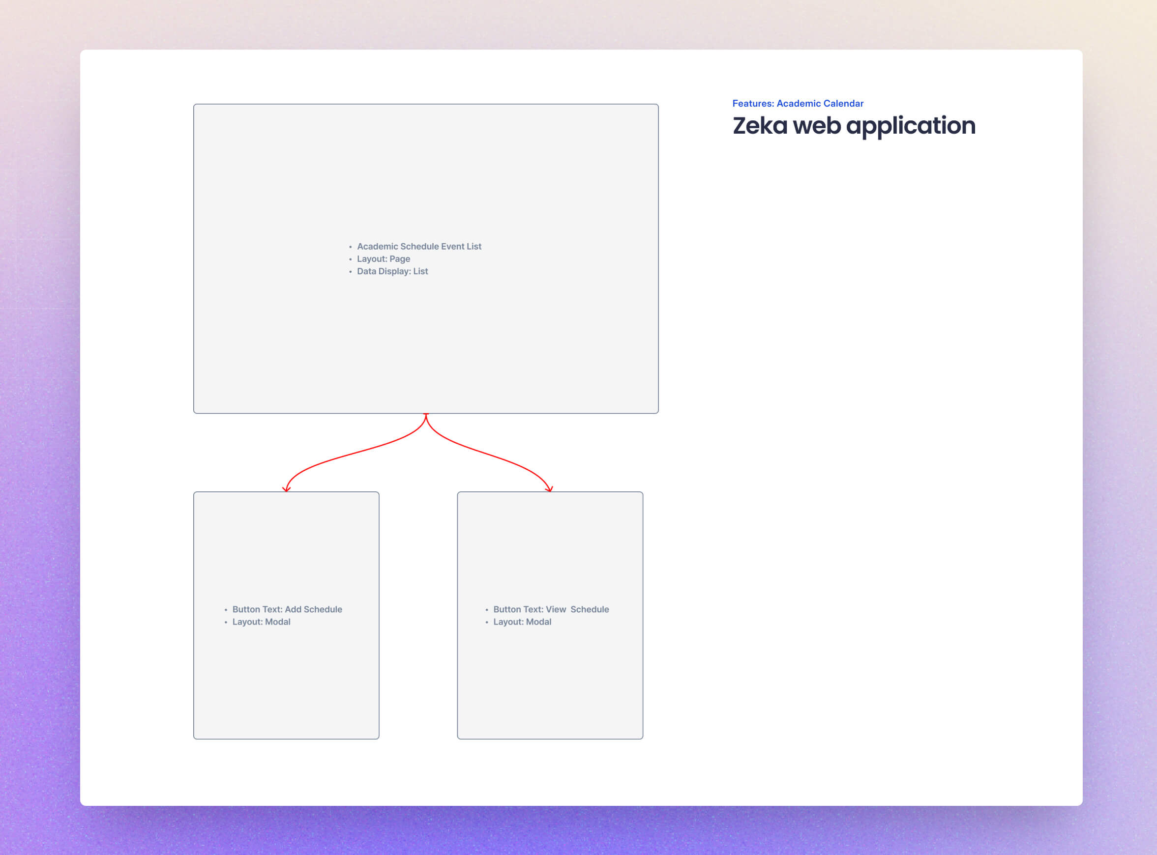
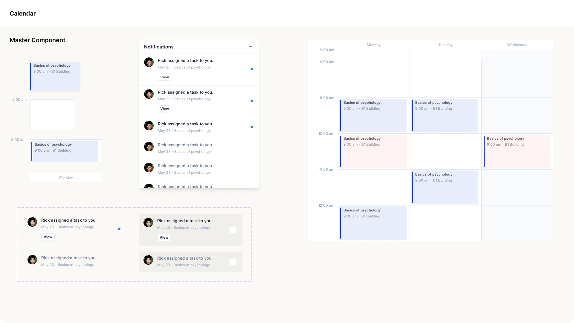
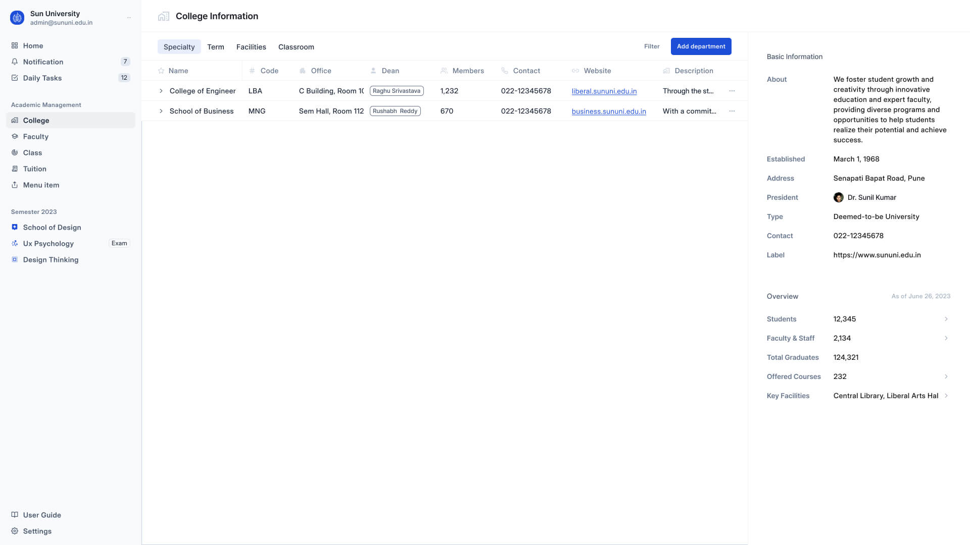
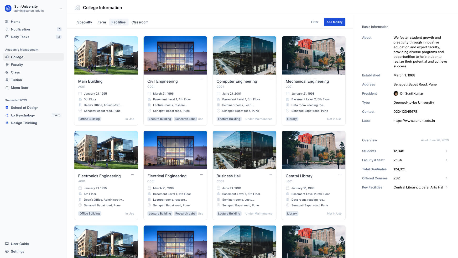
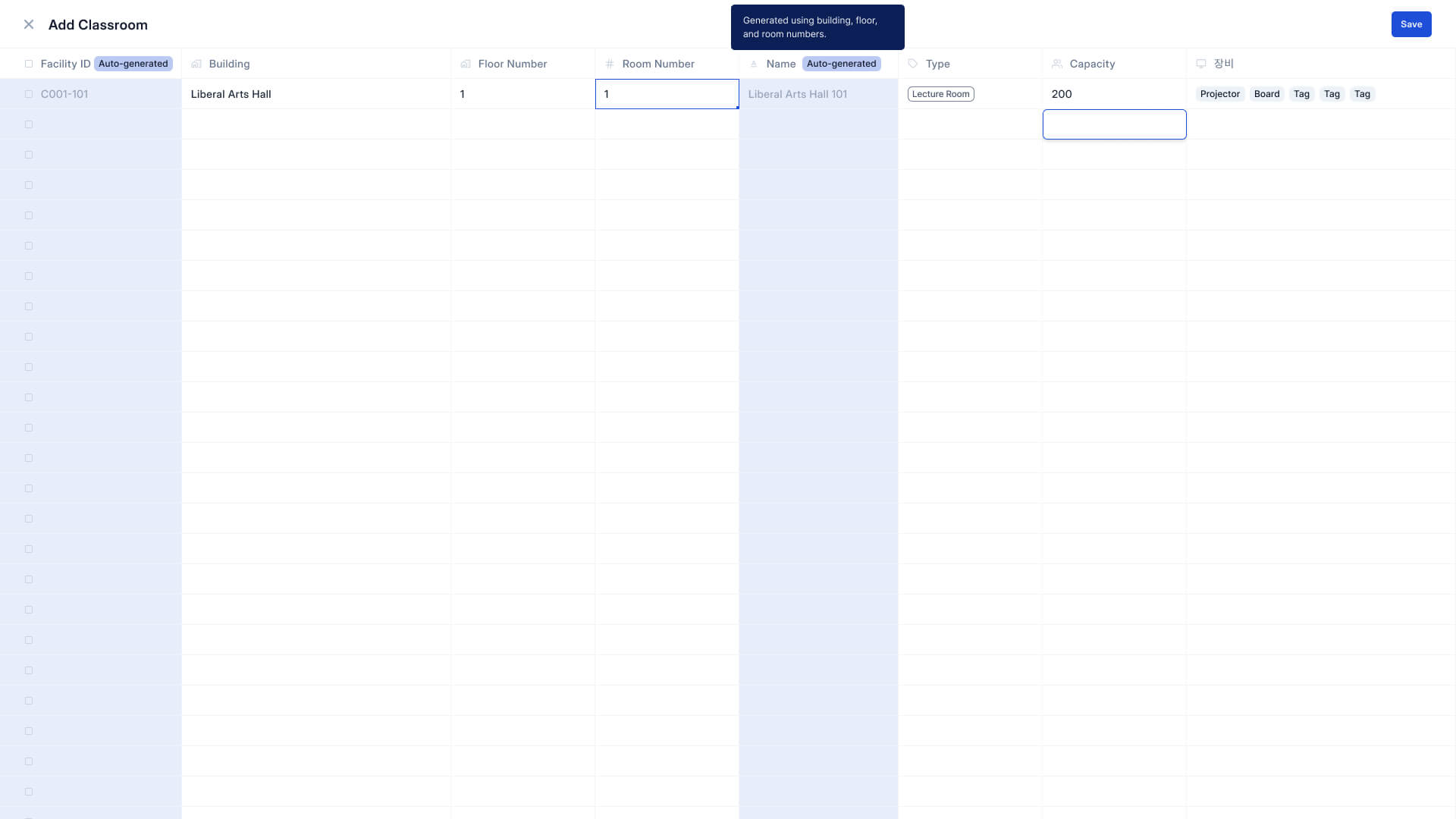
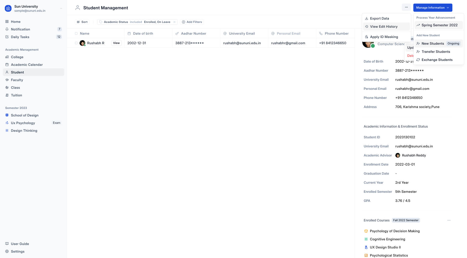
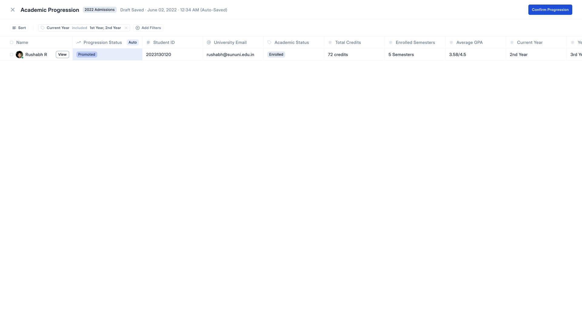
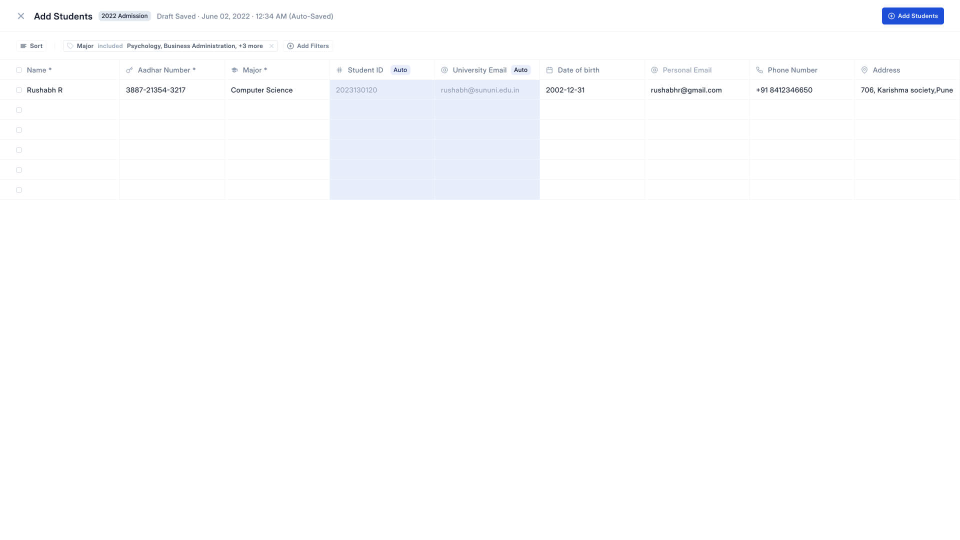
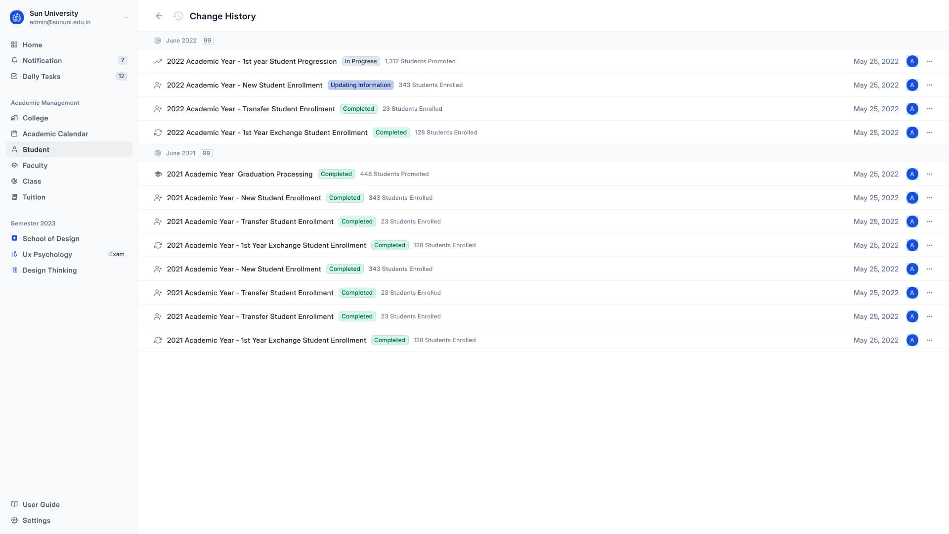
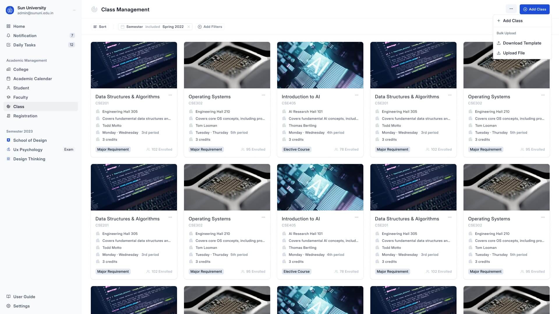
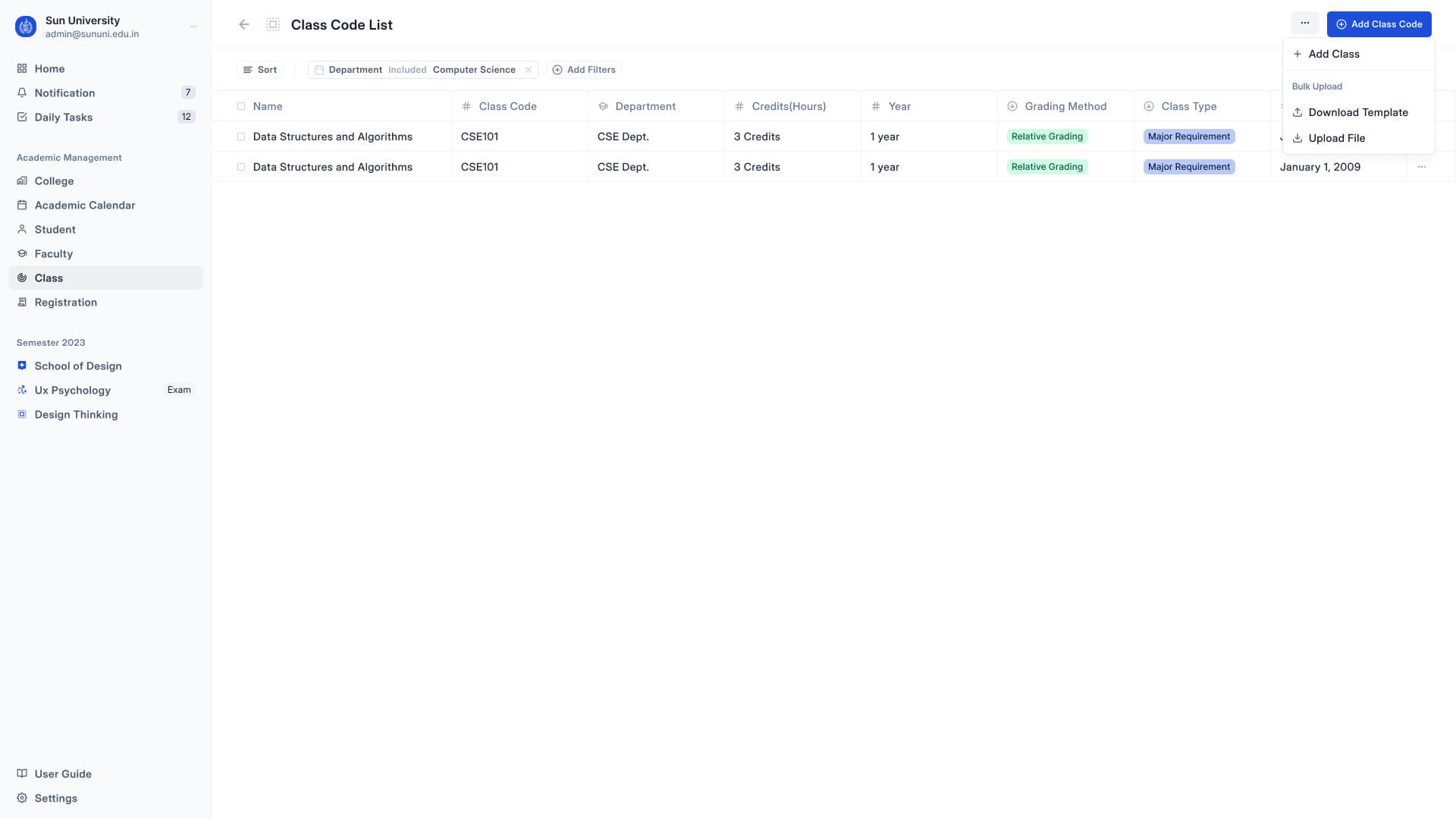
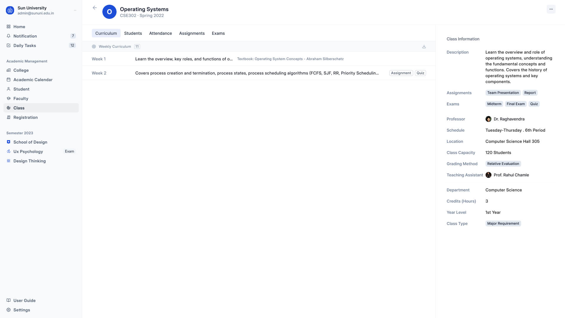
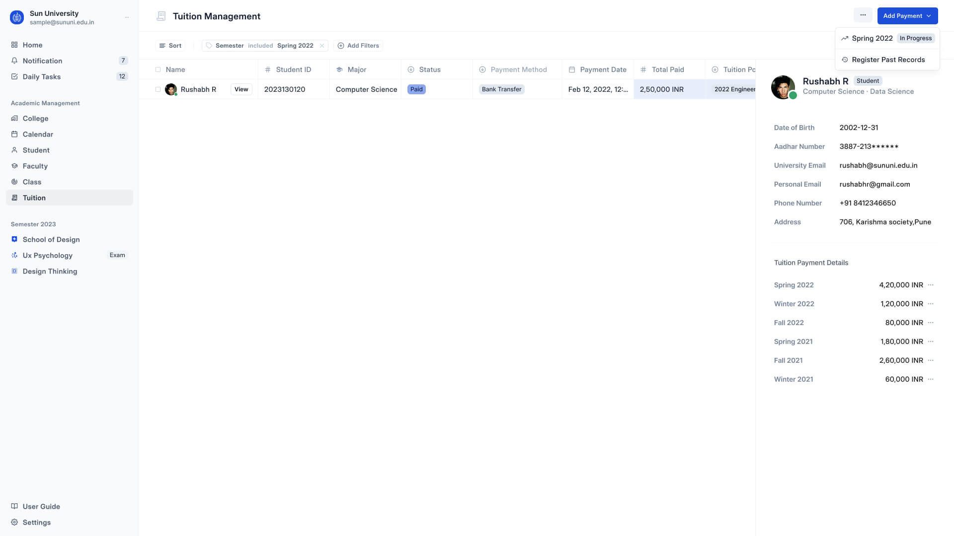
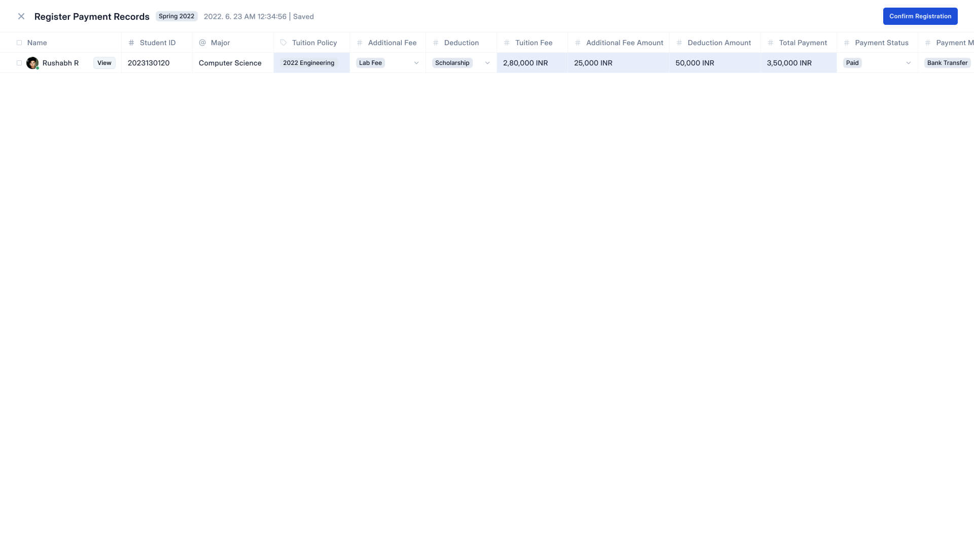
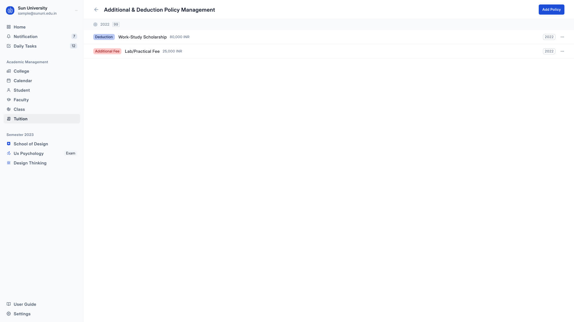
UI Design
Here are the Hi-Fi UI images for the Dashboard, Grade Entry, and Registration screens, designed to streamline tasks for teachers and admins. Student features will be added later.


Interactive prototype
I created a Hi-fidelity prototype in Figma to demonstrate some of the interactions and flow of the product.
My Learnings
- Working on this project was both enjoyable and challenging. I am grateful to all the people who took the time to participate in my research and share their valuable insights. Through this process, I learned a great deal about the diversity of opinions and the importance of user research
- During my UX process, I incorporated several new concepts such as Customer Journey Mapping, User Flow, and Information Architecture. Learning these concepts added significant value to the research data I collected and streamlined the process considerably.
- Through stakeholder interviews, I learned the importance of understanding the needs and goals of all parties involved in a design project. This process helped me to streamline my design process, reduce anxiety, and focus on the needs of the user
- I learned that there is always room for improvement in any design, and that perfection should not be the goal
